
This blog is part of a series sharing tidbits from our Blue Garnet toolkit. Follow along for blogs on evaluating advocacy efforts, networks, and more!
If you clicked on this blog, chances are you’re curious about how to visualize data you already have. Maybe you run a few surveys a year and are trying to make sense of the too-many bar charts your software spits out. Maybe you work in dashboards every day and you’re tired of seeing the same old pie charts, that don’t seem to tell you anything new (and they make you crave dessert!). Whatever your experience with processing and visualizing data is, you’ve probably looked at your data and asked, “So what does all this actually mean?”
You’re not alone. In a day and age where data on all sorts of topics are regularly gathered and made available, we have more information than we know what to do with. We’re frequently confronted with pretty charts and seemingly informative visuals (or, on the extreme end of the spectrum, these hilariously unscientific bar charts) that, in the end, don’t really tell us anything.
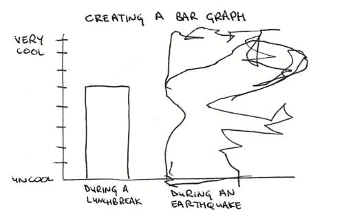
Creating a bar graph during a lunch break: medium cool. Creating a bar graph during an earthquake: well, who knows what those scribbles say (let’s assume maximum cool?)
Source: Coolness Graphed
At Blue Garnet, we set out to measure what matters. Our clients come to us tired of charts and jargon; they want to make meaning of data and to hear the crisp story it can tell. Good visualization can be a powerful tool to focus our attention on what matters, what questions to ask, and what decisions follow. It can reveal an emerging story as you’re making sense of the data (think of a dashboard that allows you to visually catch patterns that you can then dig deeper into), or help you tell the story to others. So how we do we pull that meaning and insight out of data?
But wait – before you even begin making a chart, first consider:
- Who is your audience? Board, staff, leadership, program participants, volunteers, etc. all have different data interests and needs.
- What are they trying to learn (what is the ‘so what’)?
- Are they technical, or non-technical (what is their comfort level working with data)?
Once you’ve established a baseline understanding of who you are speaking to and what is important to them, you can elevate your data visuals to the next level. Here are a couple examples of how we have elevated our own storytelling at Blue Garnet:
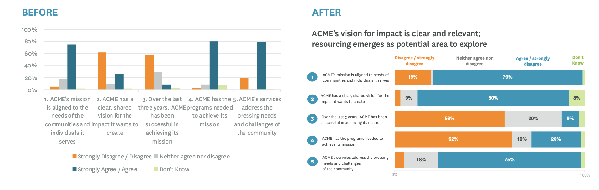
EXAMPLE 1: Flip it! With survey questions, it’s easy to veer towards just reporting out the results, such as giving the distribution of answers by survey question. This doesn’t prompt us to consider the larger picture, which is that the survey as a whole tells us whether the organization has clarity on who it serves, how it serves them, and how it affords it. So, we turn the Before chart on its side to reveal the After story, providing a descriptive headline and visually prompting our audience to consider how the questions “flow into” or connect with one another. When we do this, we see a clear lean in respondents disagreeing or strongly disagreeing with Statements 3 and 4, which relate to effective resourcing and programs.
EXAMPLE 2: Simplify, simplify, simplify. This principle takes us beyond revamping just a single graph and prompts us to consider more broadly how we can present information in a meaningful way. Here is an example of how we redesigned a multi-year, multi-cohort assessment report (adapted from a real-life client example):
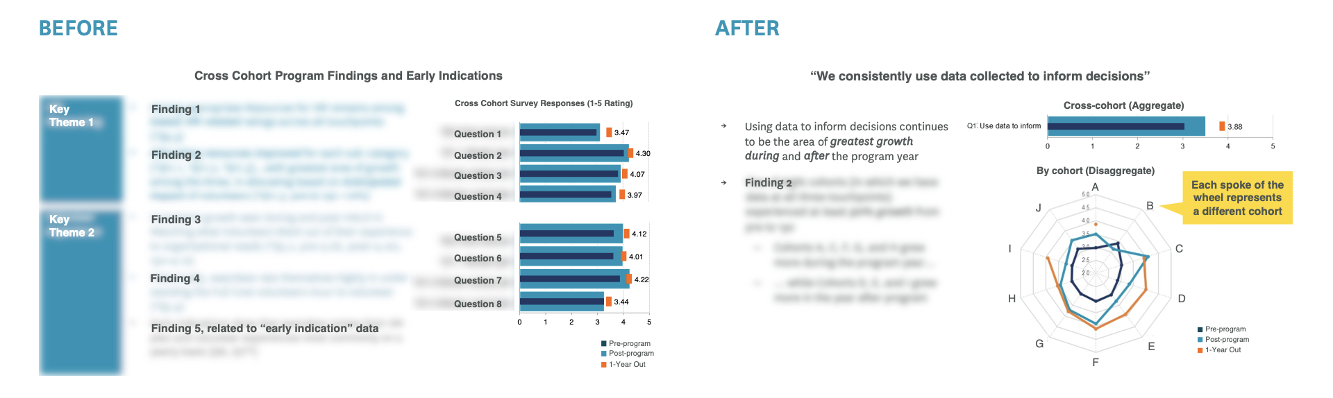
Before, the slide held a lot of content to take in at once, and it wasn’t easy to tell which data were “historical” versus “new findings.” After, we organized the slide by the key takeaway, and only included analysis relevant to that finding (the rest was moved to the Appendix!). We presented the data in both aggregate (cross-cohort) and disaggregate (by cohort) form. Now, our visuals communicate “what the audience needs to hear” (considering their “so what?”), instead of “what we want to say.” As data geeks, we know a lot can be said – but, focusing insights around only the most critical data is the best way to equip the decision-makers in your audience.
Last, we leave you with a few best practices for data visualization:
- Declutter your visuals, prioritize what you share, and focus on what matters. Bring clarity to your visuals by providing only necessary context and emphasizing key takeaways.
- Make sure your graphs are accessible to a wide variety of audiences with visual needs. Don’t let design trends dictate how you visualize data – for example, infographics are certainly aesthetic, but may leave you vulnerable to misleading charts, irrelevant information, lack of sourcing, and convoluted narratives.
- Check in with your audience, to make sure it’s clear how the data (and visualization) you’re sharing connects to the decisions they need to make.
- Subtract to add value. Studies show that to add is human; we tend to want to add more data, more detail, more explanation, AND decrease the font size, instead of taking things away! As you can imagine, having too much information actually makes it harder to understand the main point. So, focus on key findings and leave the details for the Appendix.
- Don’t lose sight of the big picture. Ask “so what?”, and measure what matters.
If you have any questions about visualizing data or examples of lovely and effective data visualization of your own to share, send them our way at hello@bluegarnet.net!
For more examples and guidance on best practices for data visualization, check out:
- The Dusty Shelf Report Mini-Course, by Ann K. Emery (it’s free!):
- American Evaluation Association (AEA): Data visualization websites & tools
- American Evaluation Association: Data visualization examples.