
by: Taylor Chamberlin
Through their course in Pepperdine’s Master of Arts in Social Entrepreneurship and Change Program, Way-Ting and Jenni are teaching social entrepreneurs to think about, measure, and evaluate their organizations’ impact. I recently had the opportunity to sit in on a class session, which focused on data visualization.
By following these six principles of data visualization, whether you are communicating about a foundation, nonprofit, or, in the case of this course, a budding social enterprise, you’ll be primed to effectively marry “the head and the heart” to communicate your value and tell your impact story.
1. Be clear about your goal Most data visualization is explanatory (directing you to a question’s answer) or exploratory (helping you understand data). You may be seeking the answer to a specific question, or you might want to understand a larger data set, but whatever your goal may be, make sure to clearly address it.
2. Consider the “trinity” of designer, reader, and data Being intentional about your data visualization doesn’t end with establishing a goal. You should also keep in mind the roles of the designer (that’s you!), reader, and the data itself. A visual designed for a 3rd grader is going to look a lot different than one designed for a CFO—you have to know your audience!
3. Make data accessible (including context) No matter who you are sharing information with, they will need context to understand its meaning. For example, the Los Angeles poverty rate at a given time is an interesting statistic, but is much more meaningful in the context of poverty over time in Los Angeles, or the poverty rate in other comparable cities. Without context, insights are limited.
4. Use the eyes and the brain
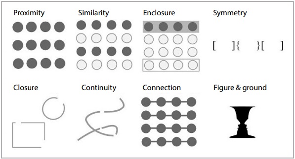
Source: Fusion Charts White Paper: Principles of Data Visualization – What We See in a Visual
We all have an ingrained tendency to make order out of chaos. The way we perceive the world is guided by Gestalt Principles; the diagram to the right shows a few of the ways we organize and understand information. Use the way our eyes and brain perceive information to communicate clearly.
5. Practice graphical excellence Adhere to Edward Tufte’s principles of graphical excellence:
- Data integrity: show the true data, don’t distort it, and give comparisons for context
- Data-ink ratio: use the space you have wisely, and don’t waste it with unnecessary visuals
- Message coherence and data density: synthesize information and balance complexity with simple, beautiful designs
6. Tell your impact story Use high-quality, relevant data to tell a real, human story. Avoid cherry picking data points, overinflating statistical significance, or mistaking correlation for causation to ensure you maintain your integrity.
The famed, penultimate example of this is Charles Joseph Minard’s data map/time series plotting six variables: latitude, longitude, direction of the army’s movement, time, temperature, and the army’s size. More importantly, it humanizes the data, telling a compelling impact story about the tragic human cost of war.
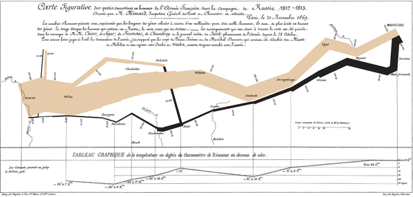
Charles Minard’s map of Napoleon’s Russian campaign of 1812.
Share with us: What is the best (or worst) example of data visualization you’ve seen recently? Copy a link into the comments section so we can discuss it with you!
To learn more about visualizing your impact, check out The Moz Blog’s “Data Visualization Principles: Lessons from Tufte” and Edward Tufte’s book, The Visual Display of Quantitative Information.